For the show I hard-coded the size of the shadows beneath the card being flipped, but in a Responsive Web Design world that's rarely ideal: we need flexibly sized elements, and it would be nice to have a shadow for it that is always 'magically' the right size for the element it's beneath.

It would be nice to have a shadow for it that is always 'magically' the right size for the element it's beneath.
There are a bunch of ways you can approach a problem like this, but not all are equal from a flexibility and performance point-of-view.
The solution we're looking for is:
- Performance-friendly. The shadow may need to move around or fade, so we need a solution that we can animate with transforms & opacity, since they can be handed off to the GPU. It will need to be separate to the element it's shadowing, since we will likely want to fade and move it without affecting the other element.
- Edit-friendly. None of us wants to be creating a bunch of shadow graphics, and we want something that's easily updated.
Attempt one: animating box-shadow #
The box-shadow property is probably one of the most useful additions to our CSS armory in the past decade or so: it meant we could easily add shadows to our elements on the fly. (It's up there with border-radius for me.)
But box-shadow is applied to the element directly, which means if you want to animate it you change things like its x & y offset, or the blur value. That causes the browser to paint on every frame of an animation, since the shadow has been 'invalidated' by the change.
We can't separate the shadow from the element itself with box-shadow, making it impossible to animate performantly.
Attempt two: a blur filter #
Next, let's quickly talk about a works-but-dang-it-is-slow approach to doing shadows: CSS Filters. Seems like we could use something like filter: blur(12px) (or in the case of Chrome -webkit-filter, though I'm not totally sure why it's still vendor prefixed).
That will take an element that looks like this:

And turn it into one that looks like this:

Terrific! It's visually correct, and we can change the size of the element easily enough, but there's a performance problem: the blur is applied late on in the rendering pipeline, as a post-processing step. This means that every time the pixels change in any way, the blur (or any CSS filter effect) has to be reapplied. For a cheap filter this is no big deal, but for anything calculated by convolution, like a blur, you're going to be paying a penalty if the element moves in any way.
It's animating and will need to be blurred on every frame. This is prohibitively expensive on mobile, where CPUs and GPUs are less powerful.
A shadow moves as the card flips, and so it's going to suffer from this problem: it's animating and will need to be blurred on every frame. This is prohibitively expensive on mobile, where CPUs and GPUs are less powerful. For added pain points a bigger blur takes longer to calculate than a small one because it involves convolving more pixels. In any case, poor performance.
Attempt three: SVG + Filter #
What we really want to do is bake that blur into the image itself, not create it on the fly. There are three ways we can get that done: a canvas (overkill), a PNG (fine, but if I want to change the blur value I have to make images again), or with SVG.
SVG just has a huge surface area, and oftentimes I'll think a visual effect is going to need some kind of gymnastics, only to discover that, yep, SVG has been able to do it forever. We can make a shadow with some SVG that looks like this:
<svg
  version="1.1"
  xmlns="http://www.w3.org/2000/svg"
  width="112" height="112">

  <!-- Define the blur -->
  <defs>
    <filter id="blur-2px">
      <feGaussianBlur
        in="SourceGraphic"
        stdDeviation="2" />
    </filter>
  </defs>

  <!-- Make a rect that uses it -->
  <rect filter="url(#blur-2px)"
    stroke="none"
    fill="#000000"
    x="6" y="6"
    width="100"
    height="100"></rect>
</svg>
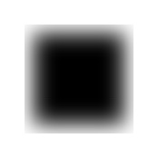
Which looks something like this:

Good news here is that we've maintained editability with using SVG, because we can up the blur value and that's going to save us having to bake out a load of images. In my particular example I needed one box at 2px blur, and another at 12px blur.
Too much blur? Ohai clipping. #
When the stdDeviation is upped from 2 to a bigger value like 12, you'll get some sharp edges:

Yeahhhhhh, no. A look over Stack Overflow (thx Tangui!) and the SVG Filter Effects spec yields this little gem:
The bounds of this rectangle act as a hard clipping region for each filter primitive included with a given ‘filter’ element; thus, if the effect of a given filter primitive would extend beyond the bounds of the rectangle (this sometimes happens when using a ‘feGaussianBlur’ filter primitive with a very large ‘stdDeviation’), parts of the effect will get clipped. - SVG Filter Effects Spec
What is the rectangle it talks about? It's a clipping rectangle applied to the <filter> element, and by default it has x & y values of -10% and width & height of 120%. So if your blur is going to be bigger than 120% of the rectangle's dimensions, those x & y, width & height values will all need to be bumped up to account for it, otherwise it's going to be clipped. It's a memory-limitation step by the spec vendors, and by upping it we're going to use more memory, but the alternative is rubbish blurs so, you know, let's get it done.
So for a larger blur the filter looks like this:
<!-- blur is big; increase canvas size -->
<filter id="blur-12px"
    x="-35%"
    y="-35%"
    width="170%"
    height="170%">

  <feGaussianBlur
    in="SourceGraphic"
    stdDeviation="12" />
</filter>
And that gives us the look we want:

Now we need to 9-slice it up.
What is 9-slicing? #
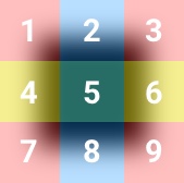
9-slicing has been around for a good long while, and it happens to be super useful when you're able to divide an image into 4 corners, 2 vertical slices (left and right), 2 horizontal slices (top and bottom), and a center piece... like this:

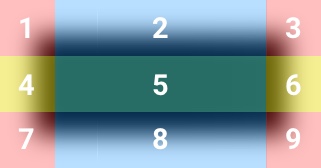
When we're able to do this, we can position the four corners in the right place and ensure they never change size. Then if the element gets wider we can stretch segments 2, 5, and 8.

For an element getting taller we'd stretch segments 4, 5, and 6.
SVG Doesn't Support 9-slicing #
Bad news: no 9-slice in SVG. I was slightly surprised that you can't dance a dance with SVG's viewBox property or anything like that, because SVG does way more than I expect it to, but in this case a big fat nope awaits. Dirk Weber has done it using <foreignObject> and I was a) impressed that he'd managed it, but b) determined I was not going to do the same thing.
Border Image is essentially 9-slicing #
Border Image to the rescue! Despite its name, it's effectively 9-slicing in CSS, and if you want the full breakdown of all its properties and whatnot then head over to CSS Tricks, since it has a lot of options and it's worth taking a little time to understand properly. In this case, however, I'll just zone in on the particulars of what I needed.
Here's the CSS for the shadow element:
.shadow {
  position: absolute;
  width: calc(100% + 12px);
  height: calc(100% + 12px);
  left: -6px;
  top: -6px;
  opacity: 0.3;
  box-sizing: border-box;
  border-style: solid;
  border-width: 18px;
  border-image: url(images/shadow-2px.svg) 18 fill stretch;
}
Interesting bits:
- I assume that the shadow is 100% width & height of the parent, plus some upsizing to account for the shadow peeking under the sides. It's not quite clear to me how much upsizing you need for a given blur value. It seems to depend heavily on which particular implementation is used for the gaussian blur filter as to how big the convolution matrix is. But basically, give it enough room to account for the blur.
- Use
border-box. In this case we probably want a border to encroach on the box size, not add to it. That said, it would mean not doing thecalc... whatever works. - Add an appropriately sized border to account for the edge blurring of the box. In my case I opted for an 18px border to give plenty of room.
Finally, along comes the border-image to fill up those 18px borders:
border-image: url(images/shadow-2px.svg) 18 fill stretch;I use:
url(images/shadow-2px.svg): the URL of the SVG.18: the number of pixels from each edge I want to use as the slices. Since I made a 100px square box in the first place I can compress that down to a single value: 18 (nopxapparently, go CSS!).fill. This means that I want the non-border bits of my box to be filled by the central slice of the blur box.stretch. This means stretch the slices to fill up the space. You can alsorepeat, which would work since the slices are uniform in my case.
Conclusion #
So there you have it, using SVG + 9-slicing to achieve a dynamically-sized shadow that can be animated performantly, and indepently of the element it's shadowing, and that can be easily edited. It meets the two criteria I set out at the start!
- Performance-friendly. Check.
- Edit-friendly. Check.
I love the web, because there's almost always a solution to every problem. The challenge is that it sometimes requires more insider knowledge than is comfortable, like the fact that box-shadow causes repaints, or that CSS filters are a post-processing effect.
In any case you, too, can use a combination of border-image and SVG to make 9-sliced SVGs for any and every occasion.