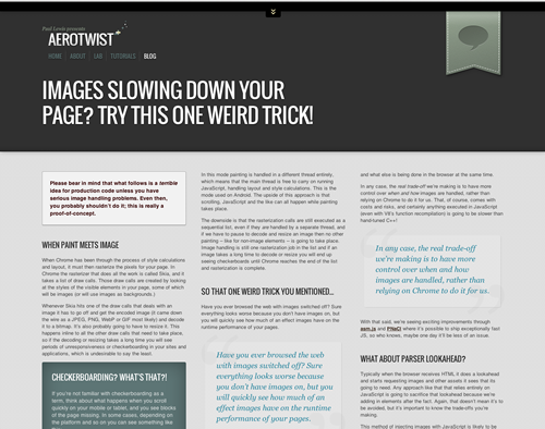
So, about that old design... #
I confess, the three column design on the old site wasn't great. Well, it was fine when I started and I didn't have lots of content. But as I get older I seem to be getting more verbose, and the old site didn't scale well for that. Then there was the fact that the text size was too small. Sure enough it became something of a readability nightmare.

So actually, calling me a clown is pretty much fine. The key to success is not avoiding failure, though. It's about learning from it and adapting.
The key to success is not avoiding failure, though. It's about learning from it and adapting.
New site #
After a lot of trial and error I finally arrived at this design. Hopefully I've nailed the readability on all devices since the type is now much larger and in, ahem, one column.
I also made heavy use of SVG, which has been interesting in and of itself. All the vector shapes around the site are SVG, and that was for two reasons:
- I wanted to prove to myself that SVG doesn't have to be ugly or revolve around that ruddy tiger.
- It saves me having to create Hi-DPI images for retina etc. There's now some Sony handset that has a
devicePixelRatioof 3, so we're stuffed whichever way you look at it for raster imagery. I'm rocking the vector wherever I can.
Same Old Priorities #
One of the main reasons I wanted to redo the site was to deemphasize some of the stuff that was on the site before. The content is still around (unless I removed it by accident) but my emphasis has shifted away from creative coding, and more towards writing for the blog or giving talks on rendering performance and tooling.
It's not that I don't want to do creative coding, I still love it, but my main priority in the past 18 months has been to help developers with front-end performance. So that's the emphasis I wanted to bring.
Practical notes #
Present me would like to remind future me, and by extension present you, that media queries based on devices is a terrible idea.
- Present me would like to remind future me, and by extension present you, that media queries based on devices is a terrible idea. Not a bad one, a terrible one. For this site I thankfully chose to start mobile first and break whenever the content started to look very wrong. At which point I fixed it and then moved on. This way no matter which device views the site, now or in the future, things should look reasonable.
- JavaScript is all but gone from the site, Google Analytics notwithstanding. Turns out I don't need any for a static content site. Shocking, I know. No templating (outside of Jekyll, which is generating this thing.) or showbiz coding... You know what, some of the showbiz is likely to come back as soon as I have time. Time! Haha! What a lark he's having.
- There is a neat Python script called html2text, which I used to grab my old site content and convert it over to markdown. Even so, converting and tidying took a decent amount of time, and I don't exactly have a wealth of content on here.
So there you go. I hope you like the new look. If you don't, feel free to call me a clown on Twitter.
<3