Better password form fields
The best experiences are all about reducing friction, and that takes many forms. Sometimes it means adding things in, like labels, tooltips or other signifiers. At other times it’s about stripping things back to the core, making it super clear what you’re supposed to do next.
Update (1st May 2014, pre caffeine): I've had feedback that my suggestion is bad because it makes you follow "a formula". I wholeheartedly agree that password forms, as they stand today, are terrible and engender terrible passwords. This is about reducing the friction in today's world by giving feedback, it's not about trying to create a completely new way of collecting passwords. It's related, but different. So with that said...
Passwords, eh? Annoying. #
Sure you can use an app like 1Password. In fact, in light of Heartbleed, that's probably pretty wise, but password fields aren't going away any time soon, and not everyone is going to rely on a generator.
The thing is, whenever I create a password there's always a list of criteria (numbers, letters, punctuation, prevailing wind direction) and when I hit submit the form normally tells me the password doesn't meet them all. It's annoying. I have to figure out what I put into my password, and where I (allegedly) failed.
I think there's a better way:
It's deadly simple: as you enter the password the checklist lights up. The guessing game is gone, and you should have confidence that you've met all the criteria. These criteria, to reiterate, are suboptimal, but it's the current state of the world.
An alternative: The tooltip #
I figured I'd also try designing an 'inline' approach, which I suspect would work much better on smaller screens than the first version:
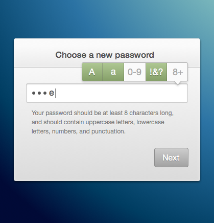
I think a key part of this is that you spell out the criteria that you have for a valid password below, so there's always that to refer to. But as you type each part of the tooltip lights up.
I'd be the first to say that the various segments of the tooltip (particularly those for punctuation and the character count) could be clearer. That's something for me to mull over, I guess, unless anyone has better ideas, in which case feel free to do a rebound!

Reduction Friction #
For me, whether it's performance or design, it's not about getting a badge of honour (though they're always nice) that says "ooh this loads quickly" or "isn't it beautiful and fun to use?" but much more about recognising that we make things that people use. They're busy, they want to get on with life and they most definitely do not want to wrestle with technology. The best thing we can do for those people is make things easier.
Let's make the web frictionless.